
0 to 1 Visual Identity
Project Responsibilities:
Visual Identity
Brand Strategy
Graphic Design
Content Strategy
Creative Direction
Hang in there!
Project Overview
For the High Achiever that enjoys a night out.
Lifelne is a premium hangover supplement designed for high achievers who enjoy a vibrant social life. Inspired by modern and sleek aesthetics, it seamlessly integrates with other high-class products, offering a sophisticated solution for those who demand the best in all aspects of their lives.
But first, we kind of need a brand, right?
0 to 1 Concepts to Ideation
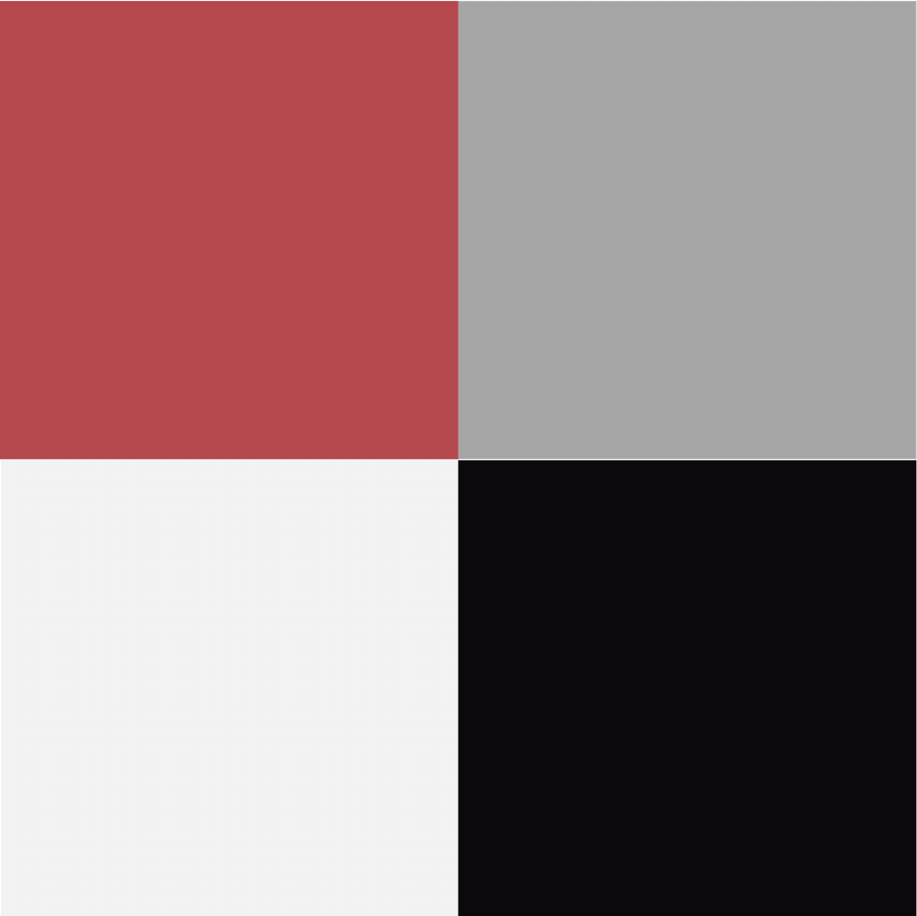
Color Palette
We wanted the color palette to be straight forward and evoke feelings of power, but not be overly distracting, to fit into the modern landscape.
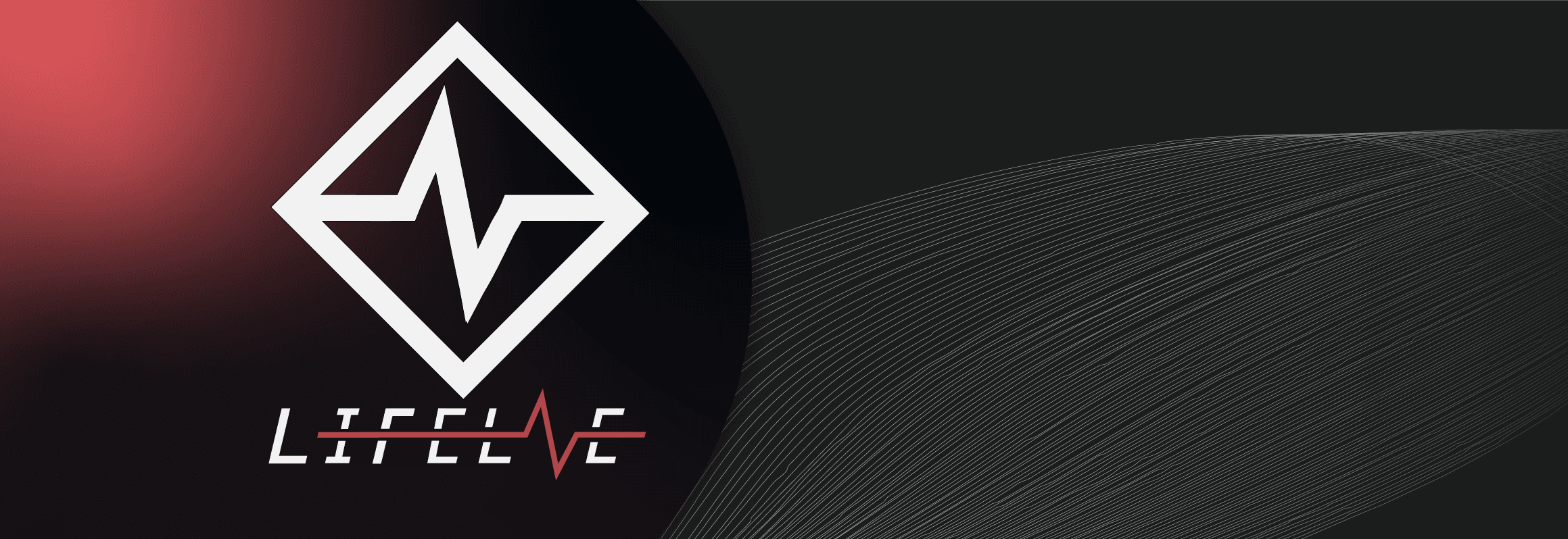
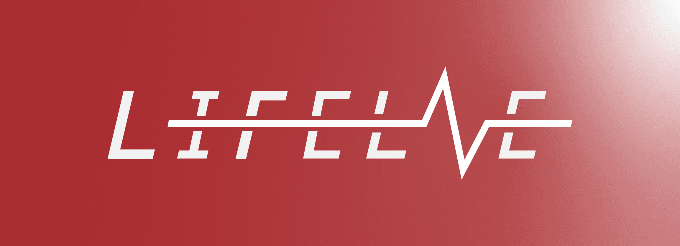
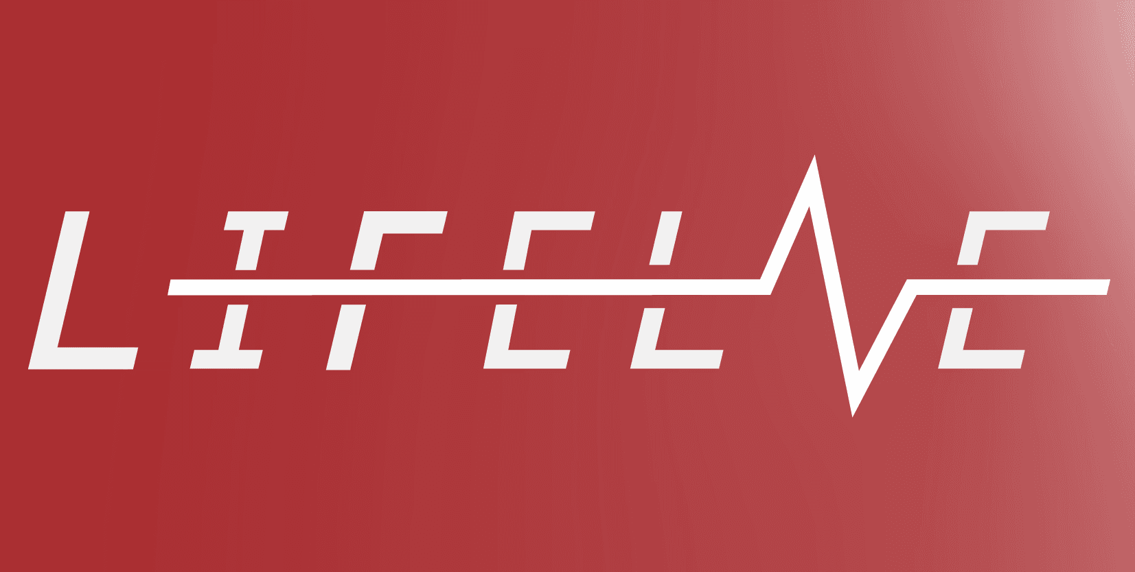
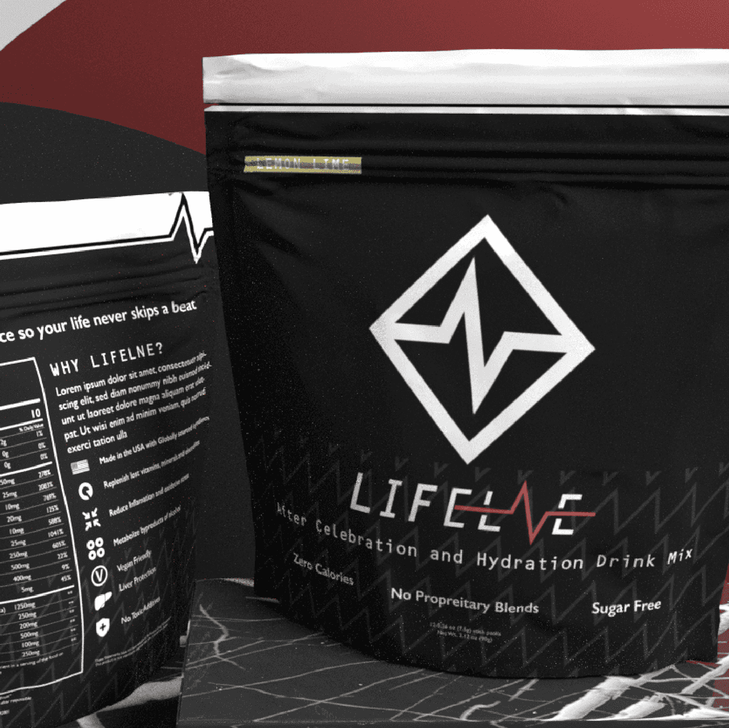
Logo
Sleek and simple. Inspired by heart rate monitors. Appealing to the high achiever in our target market, along with an essence of vitality.

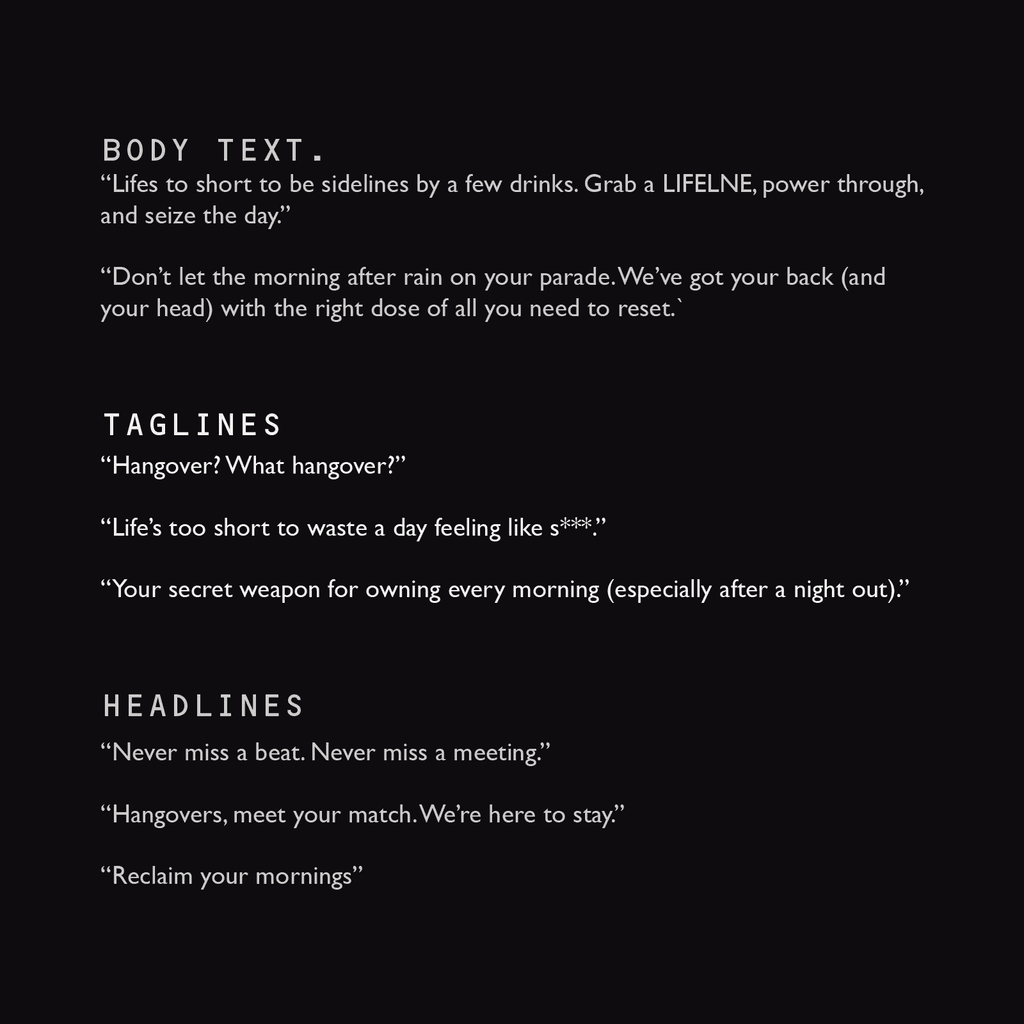
Copy Strategy
Pairing up visuals with intentional copy allowed for the brand to feel consistent across all mediums.
Visual Identity
How and where we were going to place the product in the real world. Utilizing subtle patterns, matte textures and holographic accents, a simple package becomes so much more.
How did you land on those?
The rationale and subtle nuance's explained for those who care.
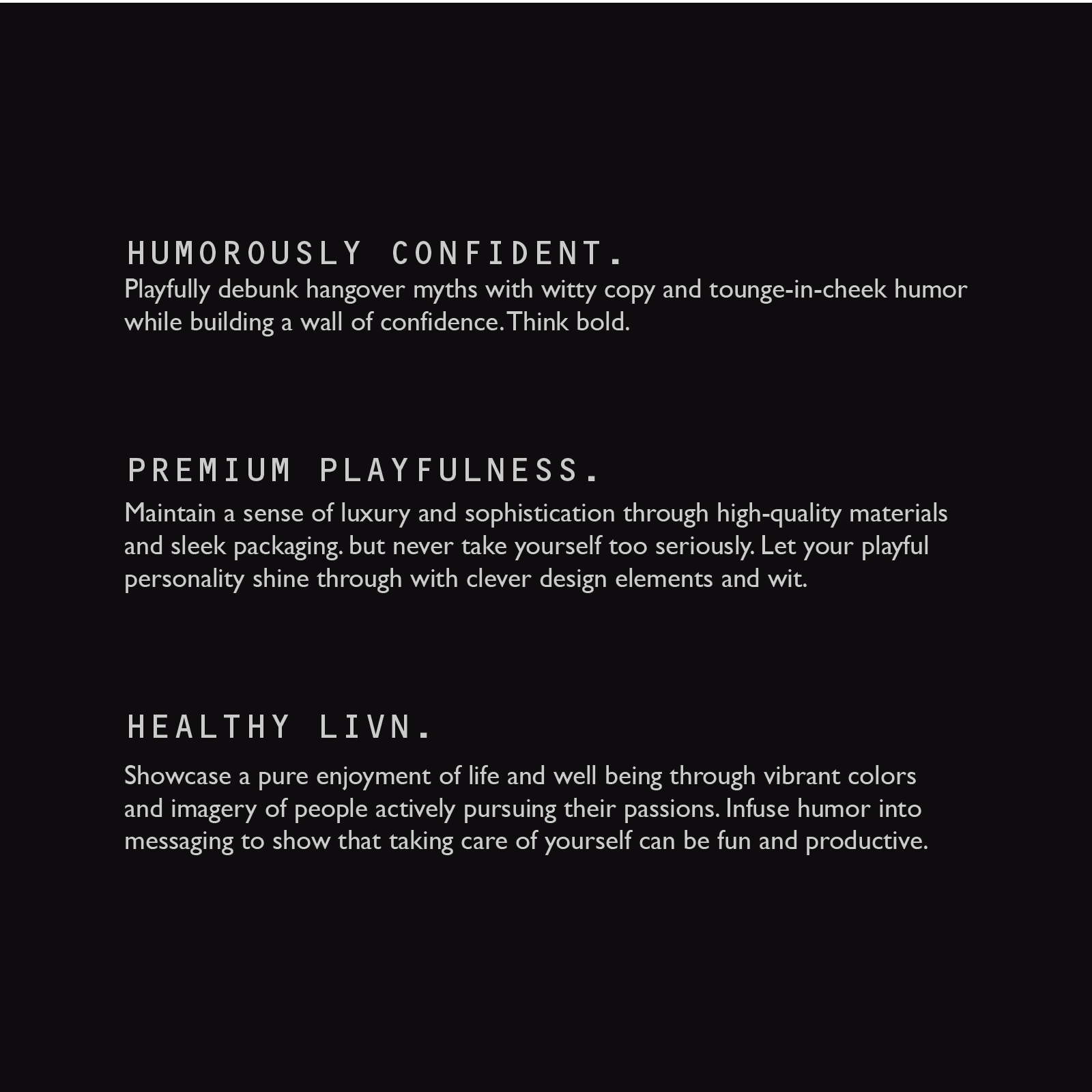
Copy Direction
Playful yet informative tone, engaging customers with health tips and product benefits.
Color Palette
Utilized bold red and sleek black for a striking, high-energy aesthetic.
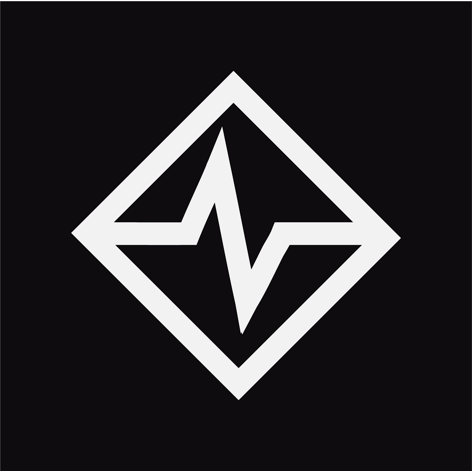
Logo Rationale
Inspired by a heart rate monitor, symbolizing health and vitality recovery.
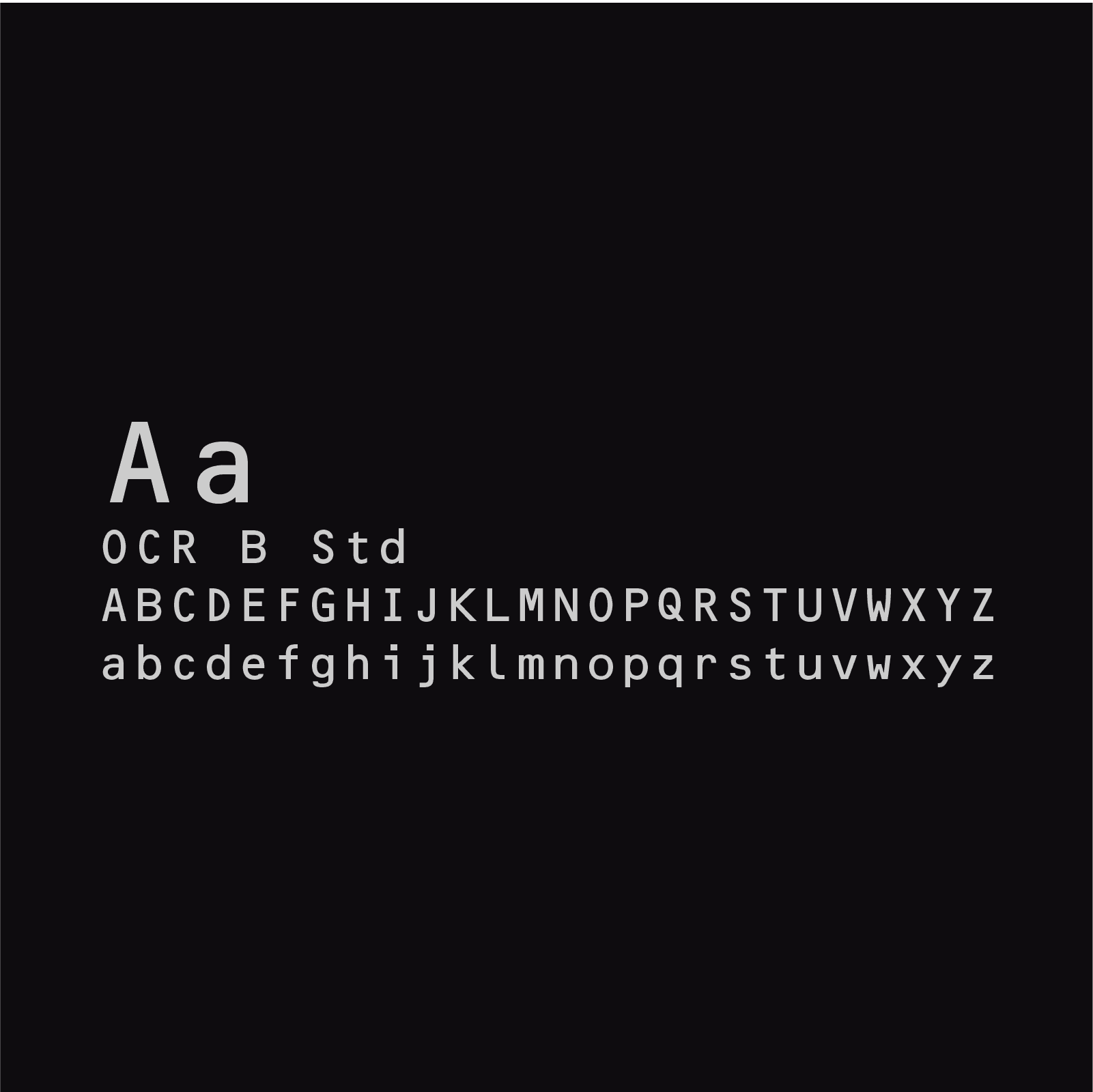
Typography Choice
Bold and blocky fonts for a strong and impactful visual presence.
Bringing it to Life
Graphic Design and Visual Purpose
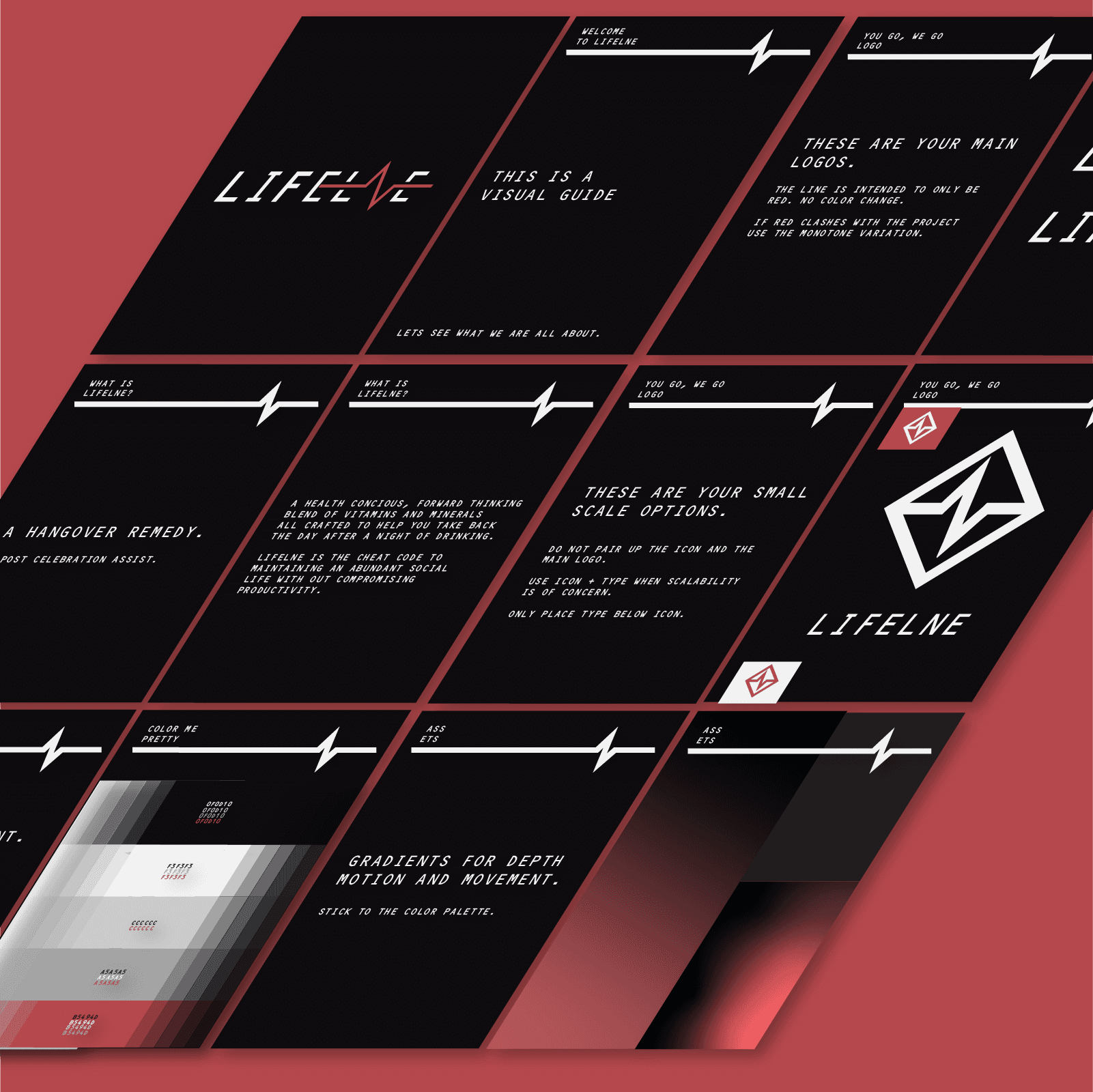
Guides + Content
Visual Guide to allow Lifelne's marketing efforts to stay consistent in the future.

Packaging
Spent time looking at various options from pouches to boxes. A huge focus of Lifelne was feeling modern and fitting into the aesthetic of a tech savvy individual. In the end we chose the box as it felt more elegant and modern.
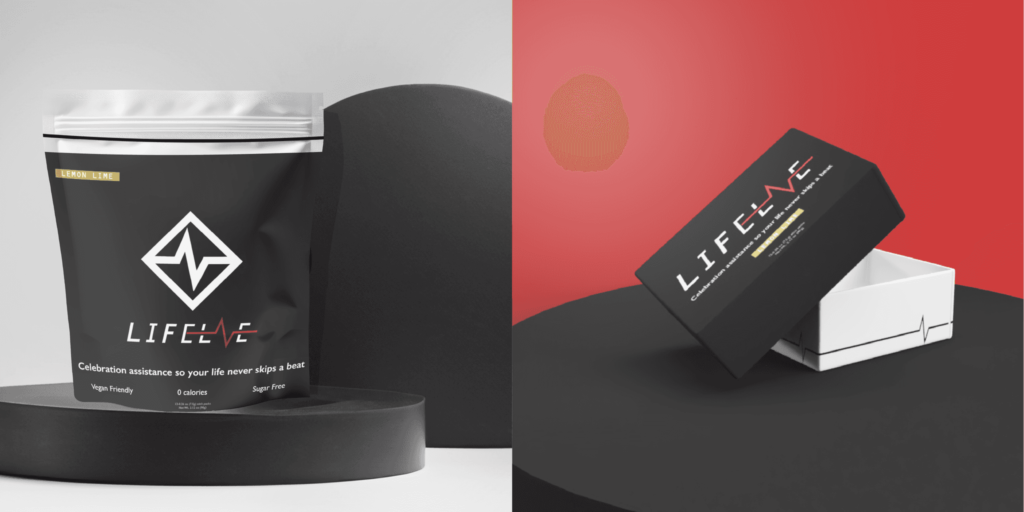
Mock Ups
What's a package design without a proper mock up? We brought everything to life. To ensure the dielines translated to Lifelne's vision.
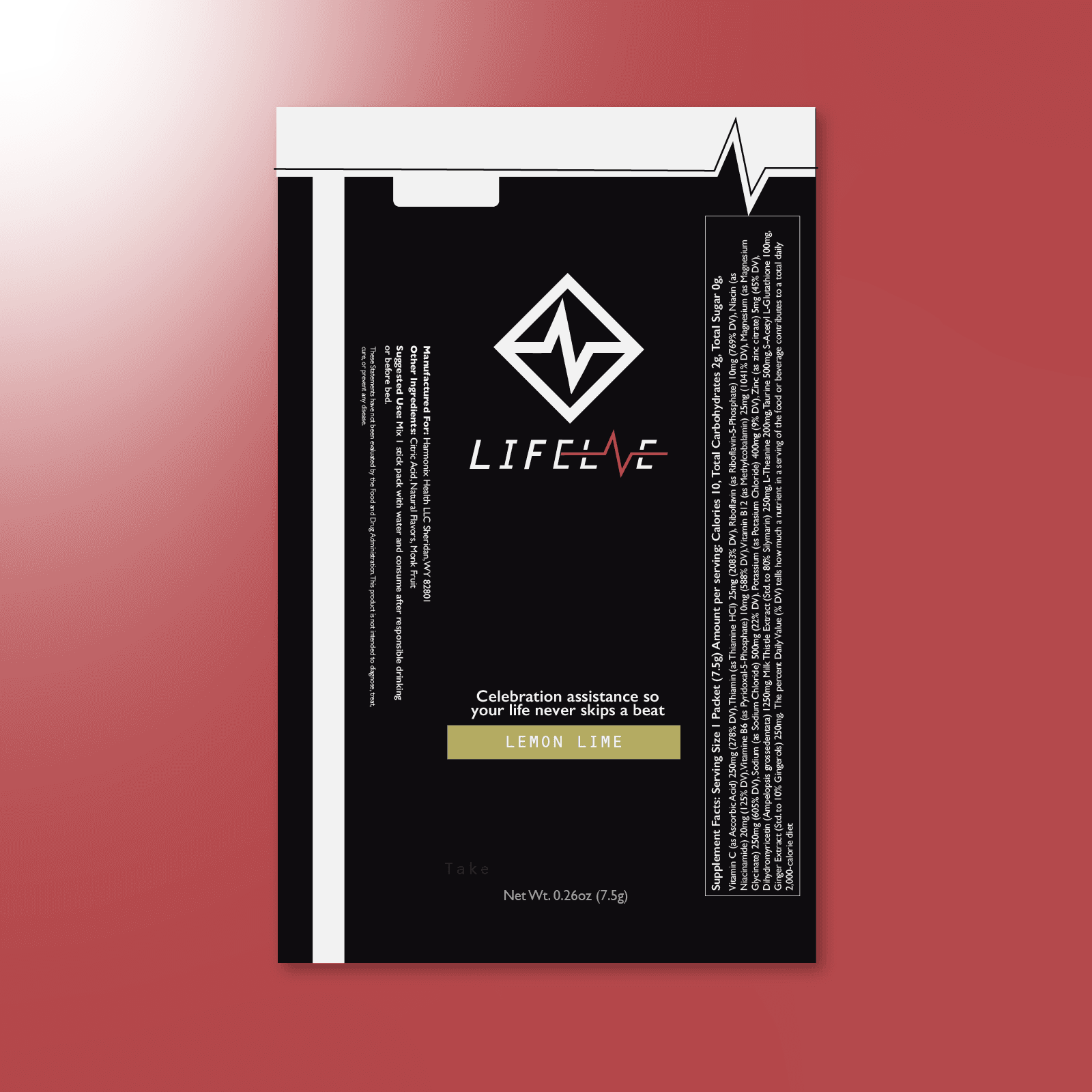
More Packaging
The individual packets had to stand out as well in and out of the box.
Wrap it Up!
Project Reflection.
It is always such a blast taking an idea and helping build it from the ground up. Lifelne was in need of an identity and we were able to bring their vision to life. The logo brings together elements of vitality, pairing with feelings of power from the use of reds and blacks, while staying modern and fun through its copy. The whole brand identity being set this early in the process will allow for Lifelne to launch with ease.

Bryan Leard
Owner and Founder of Lifelne
Designing branding that is both aesthetically appealing and unique is vital to differentiate any brand from competitors. This is why I partnered with Tusi to help develop the branding and creative strategy for a new supplement brand that I am working on. Cage was awesome to work with. We went through multiple design iterations until we eventually got a result that I was happy and confident with to take to the market.
But wait, there's more!
Explore some of our other partnerships to see how every project we work on is completely tailored to each clients individual needs.
Check our all of our currently featured projects!